Wednesday, April 14, 2010

Project2: concept design and sketches


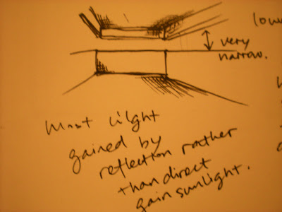
This is just a working model to explore whether the material(AL foils) I use to reflect works. I will go on thinking about the variety about these two spaces, eg the volume, the wall thickness, etc.

lower space: turn a corner with a horizontal opening reinforces the horizontal layerring of a space and broadens the panoramic view from within the space. It could bring a sense of lifting the ceiling which will make people do not feel so depressed in this relatively dark space. The corner-turing opening make the angle of the space implied rather than real and the spatial field would extend beyond its enclosing planes.

upper space: curtain wall facing the ocean to make the outside inside, some small and big openings on three other side but they are not aimed to let the inside see the outside but let the outside light focus on specific interior. This inspiration comes from Le Corbusier's Ronchamp.

These spaces are connected by a mask wall which also cut through the lower to reflect the sunlight. This inspiration comes from the L Wall of Church of Light from Ando, as well as the slit window.


Whole Concept design: since the word solitary gets the meaning of loney; living by oneself; unique; quiet; dark; secret.... I decide my space locating on the cliff above the ocean. Most of the lower space is buried under the ground to achieve absolutely private and secret; while the upper space function as a gazebo to guarantee sufficient view of outside. These two spaces are interlocked by a semi-open space which function as a mask for the upper space. I put the mask for the upper because the curtain wall I will put there would let the upper too open, while the mask wall could function as a sort of protection and also achieve a level change for the upper so that there would be a change of view of the outside. Meanwhile, the mask would cut throught the lower part and reflect the direct sunlight for the dark space to achieve a sense of snug, secret and privacy. Besides, these two main spaces are connected in a certain angle to let the change of view. There is just a slit opening for necessary direct sunlight and most of the light is got from the reflection.


Inspiration:

-Adolf's Loos' box: a sense of isolation

-Mies Van der Rohn: curtain wall make the outside inside

-Le Corbusier: way of openings: make the light focus on specific interior rather than let the inside person see outside

-Ando: Church of Light, slit openings to achieve natural light and focus on it, but most of the light in the daytime is achieved by the reflection by the mask wall.


Material: Concrete(reflection and massive), Glass, Wood

in model: white card/foamcore(concrete), film paper(glass), balsa(wood);

ps: I am still struggle with the material for the reflection part.


Project2 First attempt--understanding of painting, narrative

Discovery and Understanding: This painting seems to depict a woman who is living a solitary life, placing herself in a quiet space among the mountains and she seldom has no visitors. The relatively dark space in this painting has a snug, secure and lonely atmosphere. She is completely nude with a cigarette in her hand, looking outside and thinking, the frontiers seem to be uncertain. The shadows of her legs are long and slim, giving a sense of fragility. Outside the window in the background are two hills, like deep waves in the ocean, which makes the figure living in the nature. Meanwhile, with the bright and intrusive light, it seems to tell an impression of nature invading the sanctuary of the solitary woman.

Based on my understanding of this painting, my narrative is:
A solitary woman is eager to see outside world from her private, secret sanctuary.


Site: my choice is clilff above ocean. My inspiration of the site also comes from the painting of Hopper's rooms by the sea, that once opening the door your sight will be filled with sea. The view out of the door is actually very wide and long.

Monday, April 5, 2010

Model of Villa Muller


This photo was took when the model had been completed, showing all the levels which could be lifted up off the whole.

Model: After doing the model, I can clearly understand the interior organization since Lisa and I were responsible for the interior levels and josh&Ella were doing the site and facades. When drawing the parti for the circulation, I was curious about how people going through this villa and now I clearly understand where the stairs going and which space it is going to. Furthermore, the fantastic idea Raumplan can be understood more by doing each level that you can clearly see where the stepped height changes.

Drawings: Parti and Poche

Parti:

-Circulation: These drawings show the circulation system in both vertically (stairs on the plans) and horizontally and the areas that people could move freely. It shows different two entries of this house and each entrance lead to an independent circulation for master and servants separately. The section intends to show that there are two main staircases. Special organization is also showed in these plans.

-Programming: These drawings show the different function areas of the villa, considering the villa in a way of thinking it right and left, up and down. They show the service area, private area, public area(activity area). It is obvious to see that Adolf Loos wants the functions of this villa to be defined very clearly, public to be very public and private to be very private. Meanwhile, if the masters and servants do not want to disturb each other, they can just do not meet for a whole day in this house due to the separate circulation system and function programming.

-Visual connectivity: These partis show the openings and glasses that people could see from one space to another spaces. It is obvious to see that the sight range is wide and long. This is why Loos made the functions of the villa and areas very clearly separate, but people still feel observed by others from other spaces. The whole architectural space is like a theater. This kind of theatrical design really features this villa with a micro-relationship between the servants, masters and guests.

-Raumplan: The last two sections show different stepped height of different spaces which depends on different functions. Adolf Loos really design the space freely---"my architecture is not conceived in plans, but in spaces(cubes). I do not design floor plans, facades sections. I design spaces. For me, there is no ground floor, first floor,etc....For me, there are only contiguous, continual spaces, rooms, anterooms, terraces, etc. Storeys merge and spaces relate to each other." In his design, every space requires a different height. My understanding of this idea is space is free to design and designed in a different stepped height, rather than an independent storey. In this way, different spaces in this big space relate them into a harmony unity and this is the most economic way that could make the most of the space. For example, in villa Muller, dinning room is higher than the pantry, library is lower than the main hall.
poche:

Plan: I put it into the site plan, intended to show the relationship between the villa nad public space. You could see that the number of window to the private courtyard is more than the ones in the other two side towards to the street. Shadow is not just for the interior but also for the site, entrance footpath, stairs,etc. Different tones of shading are applied for different stepped heights spaces. Seen from the two entrances for servants and masters are in very dark tone. Especially the one for master, although higher than the other one, but since it is extremely narrow that I would like to create a stressful feeling when walking through it. This can also be reflected from the main hall and the other areas on this level.

Section: Different tones of rendering for different levels which is obvious to see. Meanwhile, some furniture and person are put into the section and plan to indicate the function and inhabitation.

The darkest Marker for the walls and the base to indicate they are in the same materials and very solid.

Final submission: Villa Muller Research

Known as an innovative landmark of early modernist architecture, the Villa Muller embodies Loo's ideas of economy and functionality. The spatial design, known as Raumplan, is evident in the multi-level parts of individual rooms indicating their function and symbolic importance. Raumplan is exhibited in the interior as well as the exterior.

The exterior displayed Loos' theory discussed in his "Ornament and Crime". Loos criticized decorated surfaces, for the exterior of the Villa Muller, Loos designed a white, cubic facade. He also wanted to distinguish between the outside, where the view could be seen by the public eye, and the inside, the private spaces of those who lived there. Consequently, the interior is lavishly decorated with comfortable furniture and marble, wood, and silk surfaces.
(http://eng.archinform.net/projekte/160.htm)

The interior of this villa is quite rich and complex. It has two entrance with different stepped heights, for the masters and servants respectively. The following pictures would guide you through the most important of the spaces within the Villa Muller:
The corridor
The hall and cloakroom
The main hall (living room)
The dinning room
The kitchen
The boudoir: this is the most articulated room in the house. Here, loos jokingly composed a relatively small room according to the principles of "Raumplan", and divided it into two horizontal levels: the upper level comprises a narrow passage giving out onto a niche with corner seating, where the lady of the house could pass the time with friends, while sometimes following events in the living room, and the lowere level was intended for Mrs Muller's afternoon rest. (http://www.mullerovavila.cz/english/pruvod-e.html)
The library
The bathroom
The bedroom
The gentleman's dressing room
The lady's dressing room
The children's room
The housekeepers' and maid's rooms now housing the Adolf loos Study and Documentation center
The Japanese Salon
The photographic darkroom
The terrace

The garage
(Pictures: http://www.mullerovavila.cz/english/pruvod-e.html)