Sunday, June 13, 2010

Project 3 submission

overall view of this gallery

section model showing part of the circulation

four entrances


some details showing the stairs which are visible when first entering this gallery, the extended gallery, the communication between different galleries, the effect of mirror reflection on the roof, etc....


Due to the charateristic of Site2 that this site is enclosed by three streets, so urban design is a key point which should be considered as well as the light and display. For the urban design, I just would like to invite those three streets inside my gallery to achieve a completely open public ground floor. This design make people move freely from the streets inside. Also, it provides people with different various options to go through between those three streets.


Apart from the main gallery on the ground floor which is a double-height permanent gallery, those three other galleries are like three long boxes with different sizes and widths resulted from their different functions. They are displayed in a disordered way and that is why the roof is a pure piece of glass which make this disorder visible by the public. Since the gallery is design in a disordered way, all the stairs in it will be completely open and visible when you first enter this gallery so you are not getting lost at least. Apart from the various sizes, each box are designed in different directions and some openings of different sizes can make those three galleries distiguish from each other, meanwhile, people in different galleries have good opportunities to communicate with each other and with the outside world, especially the extended gallery on the first floor.

Therefore, those four galleries let the visitors have different experiences, for example, since the gallery one is interlocked into the permanent gallery so people in both gallery one and two can still see the items which are displayed in the main gallery from different perspectives. Visitors can even walk on the roof to see the open workshop and people in every level can communicate with each other, the outside world and the public ground floor. Therefore, people in this gallery may feel to be observed by others and also observe others anytime, meanwhile, each box gallery is just like a item displayed that is observed by others as well.

Circulation introduction: you can go from the permanent gallery to the first gallery which connected to the gallery two -- the extended one, as well as the open workshop with some seating area. Then, you are able to go from all the spaces in the first floor upstairs to the second floor which is the galler three, the common room for visitors, the open kitchen and the big roof garden. Owner's apartment is located on this level as well.

Xu Beihong is the artist I chose since his famous paintings of horses. I put my galleries in a disordered inspired by his paintings which horses run in different directions. This design will make people have different experiences, perspectives and views, the communication among them will make the gallery more interesting

Saturday, May 29, 2010

Project3


These are my first attempt of this project.
I chose site2 since this site is challenging that it is enclosed by three streets, thus, the facades can be two or more, the circulation has more options, and the way the building can communicate with the outside world. ... It is pretty interesting to think about that.

When considering about the natural pedestrian outside, I want the ground floor gallery to be completely open to the public, galleries upstairs would be three or four long boxes interacting with each other and some can be extended to the outside to achieve the urban communication.


Due to the characteristic of the site, the natural pedestrian requires a urban design which means the gallery has a good opportunity to communicate the inside with the outside. Therefore, I designed it open to all the three streets and intend to continue the streets into my gallery and the shape is determined by the pedestrians. In this way, people are able to have different choices to go from Kings st to others, that means options of going through two of those three can be various and thus more interesting. This kind of design also kind of invites others into since the ground floor is completely open to the public and the circulation is very flexible. However, the width of those inner streets are different depends on the traffic of the three streets, such as whether busy or quiet comparatively.

These boxes can be in different sizes and heights since I want each one to have its own function and character. Different volume of the space result in different quality so that visitors can have various experience. Meanwhile, I want people in different boxes can communicate as well via openings. The openings on each boxes are in different heights and sizes, not only to see the outside but also to be observed, so that each box can be a item displayed to some extend as well.
Furthermore, the circulation from the first floor to the second floor allows visitors walking on the roof so that they would have distinct perspective and view of the displayed items.

Seating area is available in each level, and there is a roof garden on the second floor with big skylight. Skylight is also used for lighting the ground floor where the inner streets crossing each other, forming a central space for seating, chatting or drinking coffee, etc.

Sunday, May 9, 2010

Project2: Photos of final model


Light comes through slit window which light specific area.

Light comes through the skylight--light washing the wall and seat(bed).

Openings for the lower space are very limited to create a sense of privacy, just for specific areas.
These are the openings zoomed in to see the specific light they give to specific spaces.

This is the view from the above.


I spent about four days on making this model. Making this model made me think more about the functions of the space. The process of making it just like I experienced the actual space of my design by myself and doing the activities in these specific areas, especially where the light directly comes in.

Project2: Drawings and Design Concept

Narrative: A woman who lives a lonely private life likes reading.

My design is all about movement since I want the space for her is free enough for reading, living, etc... All elements of this dwelling is composed of a module 500*500mm concrete block. There is no restriction of floors, furniture, ceilings and so on which means everything can be a table, a stair, a bed, a seat so that people can do things at wherever they want in this space.

The lower part is buried underground for extreme and absolute privacy and a quiet environment. The entrance goes down to the lowest level of the lower part which make visitors feel ambiguous to go into. Openings are small but big enough for light to come to specific area so that the brightness of this space is sufficient and necessary. Furthermore, light comes through different ways, like skylight, windows and reflection from the mask wall.

Upper space, compared to the lower, is quite open. There are Large curtain walls which is enclosed by a mask wall with high-height openings on it, meanwhile, the thickness of walls are different. Therefore, It is open just for her and still guarantee her own privacy at the same time.


This design makes her can read almost everywhere and can sleep or think everywhere she likes. The movement and functions in this space are quite flexible that makes her feel free to move and makes the interior more interesting so that she will not feel lonely.


The way of movement is really inspired by Adolf Loos. My design actually does not have actual level as well. All design serve the functions-- reading, living, thinking, moving freely...


(All drawings are in the scale of 1:50)

Inspirations

This is the south-east axonometric of Adolf Loos's villa muller, which is the precedent work I did in the project1. This drawing shows the circulation of this building which reflects the essence of his design--a sense of movement of the whole space.


The above two pictures are the way of openings that Le Corbusier did in his design of Ronchamp Church. All the openings are made for specific interior areas. My design is inspired by him as well.


Ando's the church of light: Slit window and reflection wall is inspired by his design to achieve enough and necessary light, not too strong.


This is Sou Fujimoto's final wooden house. When I saw this picture, I want my space to be as free as his that people can do whatever they want, like reading, playing computer games, sleeping, eating or thinking,etc, at wherever they like. Since the space can be as free as possible to move and stay. So I use 500*500mm module as a basic element. I found that it made me feel free to design since i can flexibly put these blocks where I need. I can put them two together as a table, or single as a seat, or more together as a stair, a platform, a bed... (http://www.trendsmen.com/architecture/2010-04/259826.shtml)

Wednesday, April 14, 2010

Project2: concept design and sketches


This is just a working model to explore whether the material(AL foils) I use to reflect works. I will go on thinking about the variety about these two spaces, eg the volume, the wall thickness, etc.

lower space: turn a corner with a horizontal opening reinforces the horizontal layerring of a space and broadens the panoramic view from within the space. It could bring a sense of lifting the ceiling which will make people do not feel so depressed in this relatively dark space. The corner-turing opening make the angle of the space implied rather than real and the spatial field would extend beyond its enclosing planes.

upper space: curtain wall facing the ocean to make the outside inside, some small and big openings on three other side but they are not aimed to let the inside see the outside but let the outside light focus on specific interior. This inspiration comes from Le Corbusier's Ronchamp.

These spaces are connected by a mask wall which also cut through the lower to reflect the sunlight. This inspiration comes from the L Wall of Church of Light from Ando, as well as the slit window.


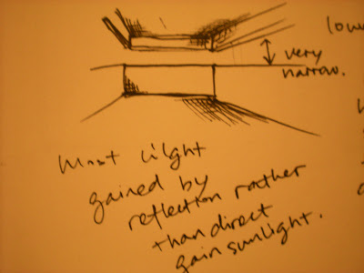
Whole Concept design: since the word solitary gets the meaning of loney; living by oneself; unique; quiet; dark; secret.... I decide my space locating on the cliff above the ocean. Most of the lower space is buried under the ground to achieve absolutely private and secret; while the upper space function as a gazebo to guarantee sufficient view of outside. These two spaces are interlocked by a semi-open space which function as a mask for the upper space. I put the mask for the upper because the curtain wall I will put there would let the upper too open, while the mask wall could function as a sort of protection and also achieve a level change for the upper so that there would be a change of view of the outside. Meanwhile, the mask would cut throught the lower part and reflect the direct sunlight for the dark space to achieve a sense of snug, secret and privacy. Besides, these two main spaces are connected in a certain angle to let the change of view. There is just a slit opening for necessary direct sunlight and most of the light is got from the reflection.


Inspiration:

-Adolf's Loos' box: a sense of isolation

-Mies Van der Rohn: curtain wall make the outside inside

-Le Corbusier: way of openings: make the light focus on specific interior rather than let the inside person see outside

-Ando: Church of Light, slit openings to achieve natural light and focus on it, but most of the light in the daytime is achieved by the reflection by the mask wall.


Material: Concrete(reflection and massive), Glass, Wood

in model: white card/foamcore(concrete), film paper(glass), balsa(wood);

ps: I am still struggle with the material for the reflection part.


Project2 First attempt--understanding of painting, narrative

Discovery and Understanding: This painting seems to depict a woman who is living a solitary life, placing herself in a quiet space among the mountains and she seldom has no visitors. The relatively dark space in this painting has a snug, secure and lonely atmosphere. She is completely nude with a cigarette in her hand, looking outside and thinking, the frontiers seem to be uncertain. The shadows of her legs are long and slim, giving a sense of fragility. Outside the window in the background are two hills, like deep waves in the ocean, which makes the figure living in the nature. Meanwhile, with the bright and intrusive light, it seems to tell an impression of nature invading the sanctuary of the solitary woman.

Based on my understanding of this painting, my narrative is:
A solitary woman is eager to see outside world from her private, secret sanctuary.


Site: my choice is clilff above ocean. My inspiration of the site also comes from the painting of Hopper's rooms by the sea, that once opening the door your sight will be filled with sea. The view out of the door is actually very wide and long.

Monday, April 5, 2010

Model of Villa Muller


This photo was took when the model had been completed, showing all the levels which could be lifted up off the whole.

Model: After doing the model, I can clearly understand the interior organization since Lisa and I were responsible for the interior levels and josh&Ella were doing the site and facades. When drawing the parti for the circulation, I was curious about how people going through this villa and now I clearly understand where the stairs going and which space it is going to. Furthermore, the fantastic idea Raumplan can be understood more by doing each level that you can clearly see where the stepped height changes.